
Video by: Reid Havens
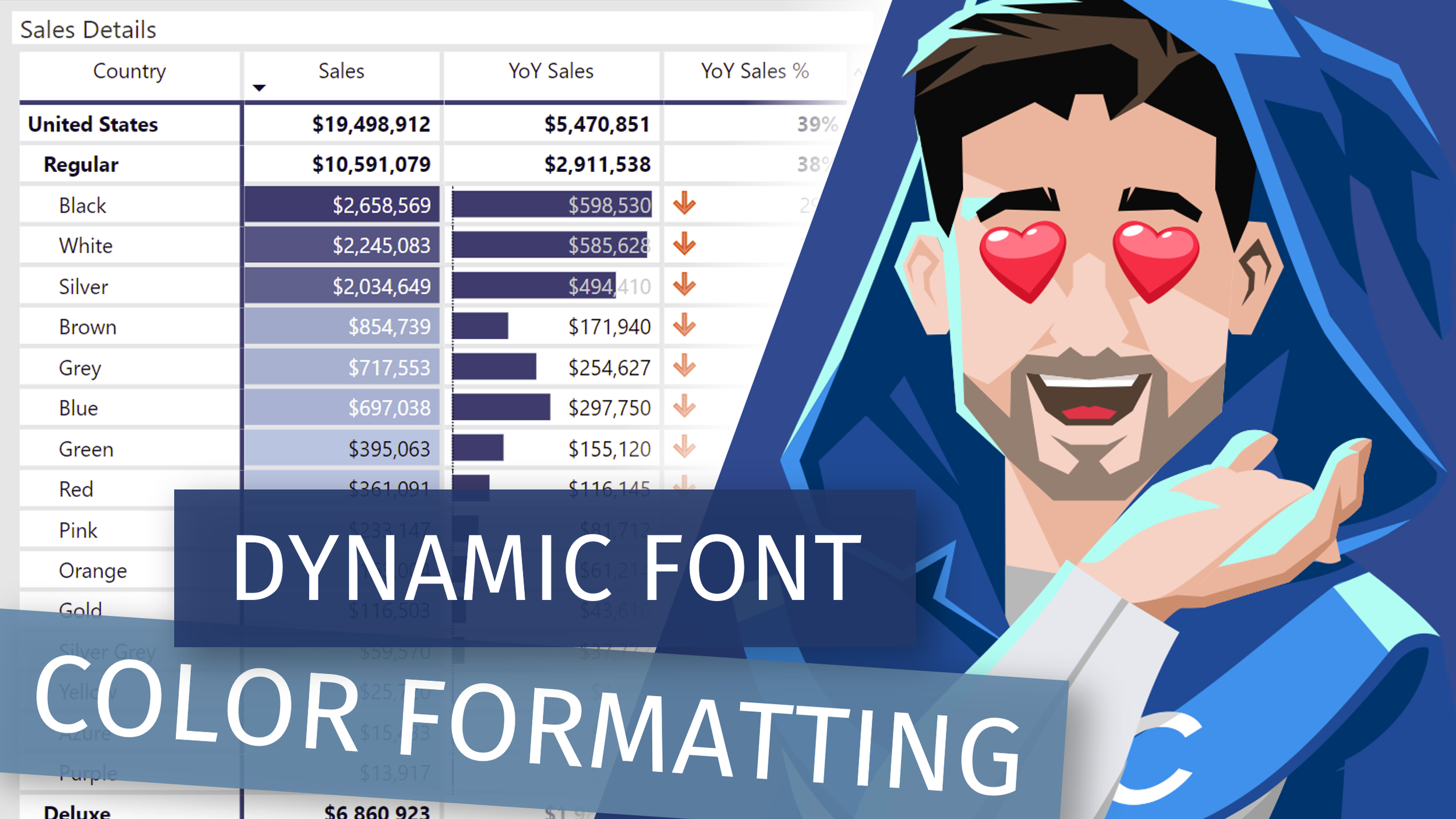
Learn how to add additional Conditional Formatting logic to font colors when used together with dark background colors or data bars on the table or matrix native visuals in Power BI.
 Havens Consulting
Video by: Reid Havens
Learn how to add additional Conditional Formatting logic to font colors when used together with dark background colors or data bars on the table or matrix native visuals in Power BI.
The Data God Guide to Power BI Gen2 walks through what is Premium, Gen2, Strategies, and demos of implementation.
Chris Wagner, MBA | Microsoft MVP Analytics Architect, Microsoft Data Platform MVP, Data God, and Power BI Boss Chris has been working in the Data and Analytics space for nearly 20 years. Chris has dedicated his professional career to making data and information accessible to the masses. A significant component in making data available is continually learning new things and teaching others from these experiences. To help people keep up with this ever-changing landscape, Chris frequently posts on LinkedIn and to this blog.
Chris's LinkedIn
KratosBI's Twitter
Chris's YouTube
Data God's Website
With the advent of Power BI Premium Per User (PPU) there are more reasons to look at moving from Azure Analysis Services (AAS) to PPU. There are several things to consider when making the move, and I will cover how to move large amounts with incremental processing and avoiding timeout issues. I will also cover how to make sure that your model is as small and as efficient as possible. And finally I will cover how to monitor PPU with Log Analytics.
Gilbert Quevauvilliers is an independent consultant at FourMoo. Gilbert has been working in the data analytics space (SQL Server, Azure & Power BI) space for over 12 years, and has been using Power BI since it’s inception. Gilbert is also a co-organizer of the Queensland Power BI User Group (Queensland Power BI User Group - Microsoft Power BI Community)
Learn how to create an (IBCS style) Bullet Chart custom visual using the Deneb Bespoke Visual Creator, created by Daniel Marsh-Patrick. Plus see some enterprise alternatives to creating your own bullet chart when we explore the AppSource store and other pre-built custom visualizations.
Vega and Vega-Lite are "visualization grammars" developed by the University of Washington Interactive Data Lab. They use a declarative, JSON-based format and this can also be used to build a range of bespoke visual designs with significantly less effort than coding from scratch. Deneb is a Power BI visual (currently in public preview) that exposes these languages and lets you bind data from your model to them.

Signup for our mailing list to gain access to Power BI files and templates from the videos. You’ll receive a welcome email with a link and password to the Blog Files page.
Reid Havens’ early love affair with analytics has, over the past decade, turned into an evolution into data visualization and report design in Power BI.
Since then Reid has been writing articles and creating YouTube videos to share the word of BI, helping to inspire the next generation of Business Intelligence enthusiasts.


