Video by: Reid Havens
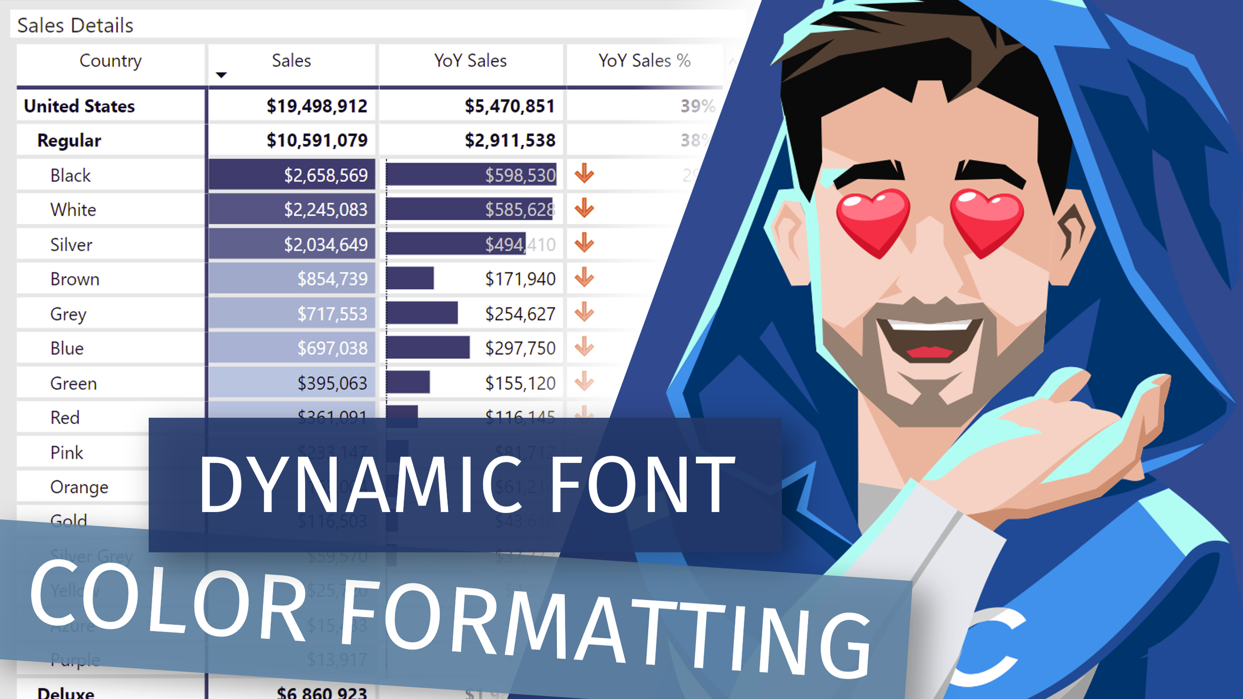
Learn how to add additional Conditional Formatting logic to font colors when used together with dark background colors or data bars on the table or matrix native visuals in Power BI.
 Havens Consulting
Video by: Reid Havens
Learn how to add additional Conditional Formatting logic to font colors when used together with dark background colors or data bars on the table or matrix native visuals in Power BI.
Video by: Reid Havens
With the addition of new button features and formatting options you can now implement custom (SVG) icons inside of a single button! Plus the custom icon can be unique for each button state (default, hover, and press), allowing for so many options to customize and design your buttons.
Video by: Reid Havens
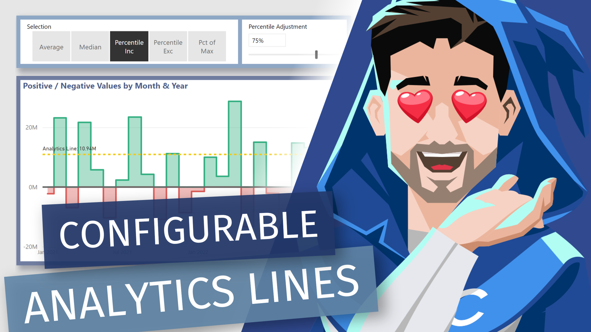
Learn how to add [DAX] measure driven values the y-axis constant lines. Allow us to essentially recreate multiple analytics lines that can be configurable by user slicer selections in Power BI.
Video by: Reid Havens
Learn how to implement a bit of Data Model & DAX magic to give users the ability to dynamically change the breakdown category selection and y-axis range for a Waterfall chart in Power BI.

Signup for our mailing list to gain access to Power BI files and templates from the videos. You’ll receive a welcome email with a link and password to the Blog Files page.
Reid Havens’ early love affair with analytics has, over the past decade, turned into an evolution into data visualization and report design in Power BI.
Since then Reid has been writing articles and creating YouTube videos to share the word of BI, helping to inspire the next generation of Business Intelligence enthusiasts.