Posts tagged #PlotlyJS

Power BI to Plotly: Build AI Dashboard Apps - with Adam Schroeder

LIVESTREAM DATE/TIME 📅

March 6th - 9:30 AM (Pacific Time)

DESCRIPTION 📄

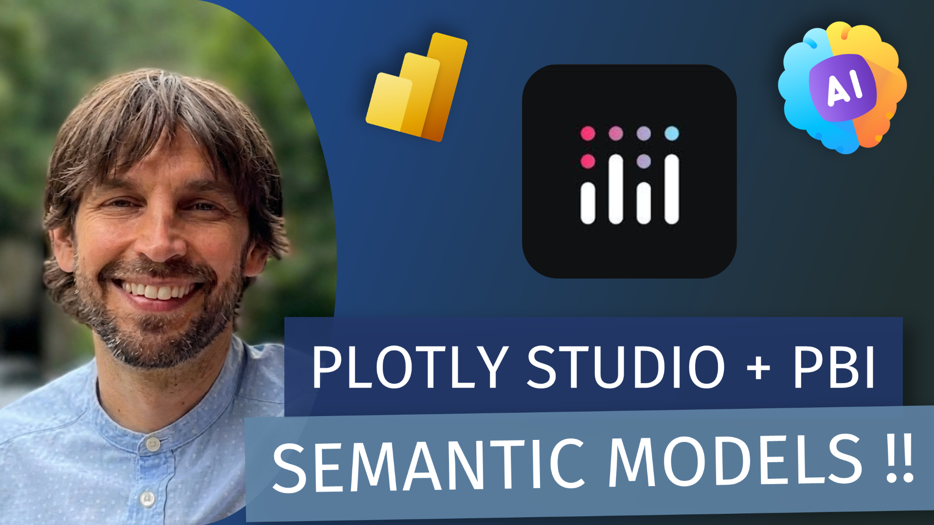
You’ve already invested in a Power BI semantic model. Cool. Now let’s actually use it outside the walls of a closed BI environment. In this session, Adam Schroeder (Plotly) shows how Plotly Studio can connect directly to your existing Power BI semantic model so you can build polished, production-ready data apps, powered by Python and accelerated with AI, without rebuilding or migrating your data.

You’ll learn how to:

  • Build fully customized, production-ready data apps using Python (beyond drag-and-drop limits)

  • Distribute apps broadly without getting crushed by per-user viewer licensing costs

  • Own your branding, UX, and deployment strategy end-to-end

  • Take a practical step toward operationalizing trustworthy AI on top of governed data

If you’re hitting the ceiling on Power BI customization, navigating licensing-based scaling challenges, or looking for more control over how insights (and AI) reach users, this is your playbook.

GUEST BIO 👤

Adam Schroeder is a Senior Developer Advocate at Plotly. He has helped grow the community through 1:1 relationships, contributing to 6 million Dash downloads per month. He’s taught Plotly Dash for over five years on YouTube as @CharmingData (over 60,000 views/month) and co-authored “The Book of Dash.”

RELATED CONTENT 🔗

Plotly Studio

Posted on February 23, 2026 and filed under Livestreams, Visualizations, Reporting, Custom Visuals.

(Livestream Replay) Introduction to the PlotyJS Custom visual - with Kerry Kolosko

Kerry will walk us through the amazing PlotlyJS custom visual! PlotlyJS is another custom visual to create your own viz designs akin to Charticulator, Deneb and PBIVIZEdit.

Plotly.js visual by Akvelon combines Plotly.js, react-chart-editor and Power BI together! This tool gives users the ability to create several types of visuals, including simple charts such as scatter charts to a variety of complex charts, such as 3D charts without code. Its JSON templating feature makes designs shareable and reusable.

GUEST BIO 👤

Kerry Kolosko is a data visualization consultant hailing from Adelaide, South Australia. With several years experience in a variety of roles across a diverse range of industries, along with a background in psychology and a passion for the arts, Kerry brings a considered and creative edge to BI and data visualization. Also a Microsoft Data Platform MVP and an avid blogger, she shares her designs and design tips at her website (link below).

RELATED CONTENT 🔗

Kerry’s PBIX File
Kerry’s Website
PlotlyJS
PlotlyJS (AppSource)
Deneb Visual Builder

Posted on August 12, 2022 and filed under Custom Visuals, Livestreams, External Tools.